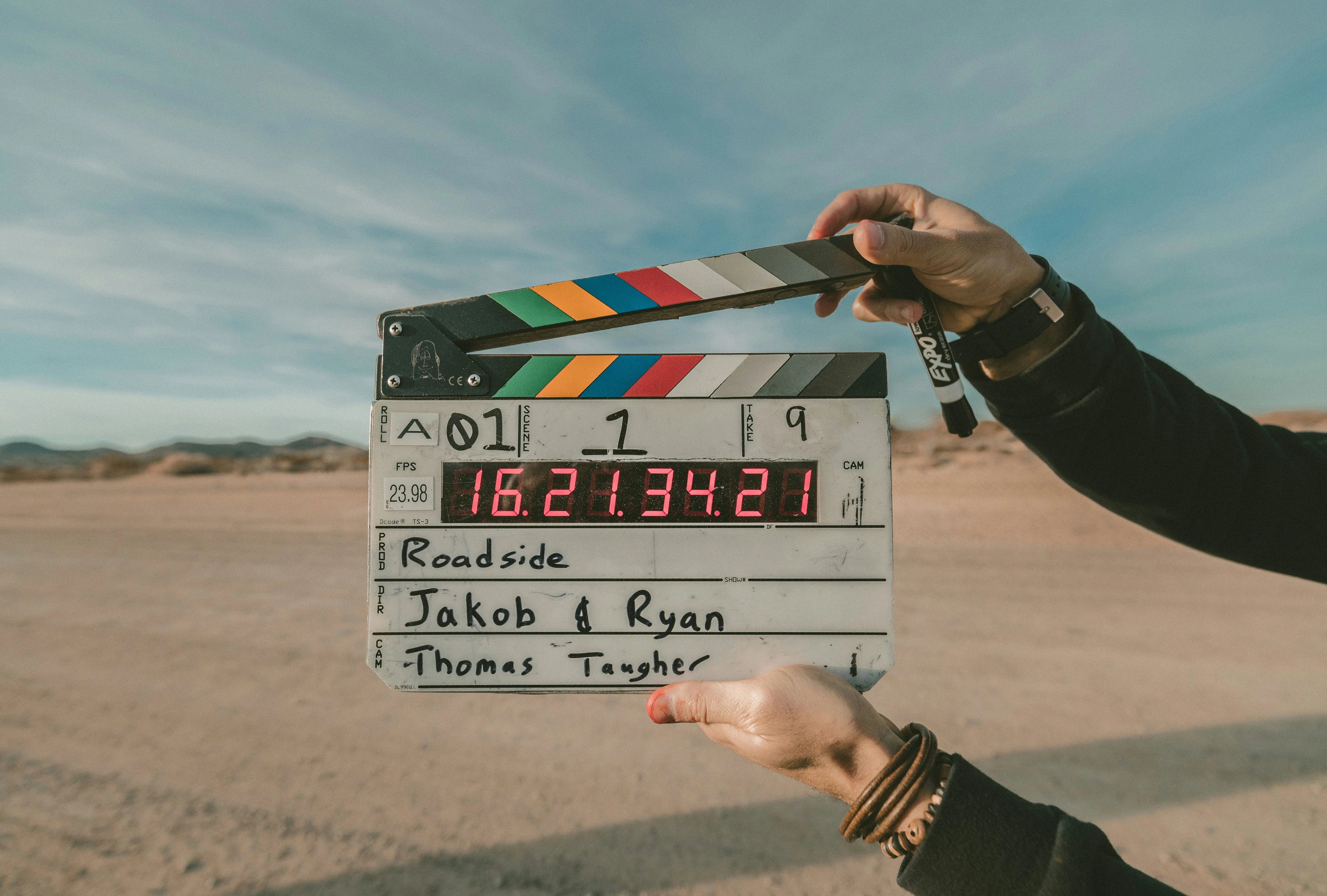
In the early years of the internet, websites were little more than digital brochures, static, linear, and largely informational. The focus was on layout, typography, and navigation. But fast forward to today, and you'll notice something striking: websites are beginning to behave like films. From scroll-triggered animations and background videos to cinematic transitions and time-based narratives, the design of web experiences is undergoing a fundamental transformation. We're no longer designing just for screens, we're directing scenes.
This shift isn't merely aesthetic; it's cultural. Our entire society is becoming increasingly video-centric. The dominance of platforms like TikTok, YouTube Shorts, and Instagram Reels has fundamentally rewired how we consume and engage with information. We process visuals faster than text. We are more likely to remember a dynamic story than a static screen. Attention spans are shrinking, but the demand for engagement is rising. Users today expect rhythm, story, and movement, just like in the media they scroll through daily.
Designers and developers have responded by borrowing heavily from the language of film. The act of scrolling has evolved into a form of pacing, much like scene progression. Sections of a website are now structured like sequences: each with its own tempo, mood, and intent. Transitions create continuity. Parallax effects simulate depth. Micro interactions serve as responsive cues. Motion is no longer decoration, it's narrative glue. Websites like Superlist or Nomadic Tribe offer brilliant case studies. As you scroll, you're not just navigating content, you're journeying through an experience. Content is revealed with intentional timing. Text slides in like dialogue. Icons animate like actors in a play. Every interaction has cinematic weight.
There's a neurological reason why this works. Motion grabs attention faster than static design. It mirrors how we perceive reality. In a competitive digital landscape, movement becomes a tool for both immersion and memorability. From an emotional design perspective, motion helps users feel the brand, not just understand it. Don Norman, in his foundational work Emotional Design, emphasizes how users form lasting attachments through emotional resonance, not functionality alone. But this trend goes even deeper when we zoom out. The convergence of video culture, short-form content, and dopamine-driven feedback loops has reshaped digital behavior. We live in a media-saturated society where stories are told in swipes, not paragraphs. Our design systems, in turn, must accommodate these new patterns of interaction. Motion isn't just about visual delight, it's about cognitive alignment. It helps the interface meet the user where they are: already halfway into a reel or a storyline.
This is where microinteractions, tiny, momentary animations or responses, shine. A button that wiggles when hovered over, a heart that pulses after a like, a loader that morphs into a checkmark, these subtle cues build emotional feedback loops. They convey personality, responsiveness, and trust. Dan Saffer's book Microinteractions illustrates how these small details often define the entire product experience. When done well, they're like facial expressions in a conversation,subtle but deeply human.
Yet, motion must be used with care. Overuse can distract, overwhelm, or even disorient users. Accessibility concerns also matter, some users experience vertigo or fatigue from excessive animation. And so, restraint becomes part of the artistry. Like a skilled filmmaker, the designer must know when to cut, when to pan, when to let a scene breathe. Great motion is invisible. It heightens experience without calling attention to itself.
Interestingly, motion also plays a role in behavior design. As Nir Eyal discusses in Hooked, interfaces that provide timely feedback and reinforcement help form habits. Motion becomes not just engaging, but habitual. It rewards interaction. A well-placed animation can act as a cognitive 'treat', reinforcing action and subtly training behavior. This is what makes motion-first design so powerful in today's context. It aligns with cultural patterns. It enhances emotional connection. It bridges the gap between functional UX and memorable experience. It helps brands speak, not just through copy, but through kinetic language.
As AI-generated content becomes more common and digital sameness increases, well-crafted motion emerges as a form of differentiation. It requires intention. It demands storytelling. It cannot be convincingly faked by a language model. Motion, by its nature, reflects care, craft, and creativity. It signals that someone thought deeply about how something should feel, not just how it should work. In this new landscape, the question is no longer just 'How should we design this page' it's 'How should this story unfold?' If websites are the new stages, then motion is the director we never knew we needed.
References
- Don Norman, Emotional Design: Why We Love (or Hate) Everyday Things, 2004
- Dan Saffer, Microinteractions: Designing with Details, 2013
- Nir Eyal, Hooked: How to Build Habit-Forming Products, 2014
- UX Collective Why Websites Are Looking More Like Movies
- Smashing Magazine: Why We Love Motion Design in UX
- The Futur Academy: Cinematic Web Design Explained
- Nielsen Norman Group: Animation Guidelines for UX Design


